WSPP

WSPP approached me to launch a newly refreshed website. As a non-profit serving the educational and local community through their school and clinic, they needed a platform that would seamlessly serve diverse users and needs—including students, clients, staff, marketing, and the larger educational community.
Beyond the website, I collaborated with the president and staff to refresh their branding, rewrite core copy, and optimize their backend operations, specifically designing and implementing a new admissions process through their existing learning management software, Populi.
By approaching the project holistically, starting with competitive analysis and careful planning of key objectives, I developed a simple, modular brand and design system that easily propagated throughout the website and physical design materials.
What started as a simple web redesign evolved into an improved ecosystem across multiple touchpoints: optimized admissions forms, streamlined website UX, updated copywriting, and cohesive marketing and donation campaign materials.
Education/Non-Profit
Design, Development, Brand, Copywriting
Brand System, Website Design, Webflow Development, Payment + Admissions Integration, Marketing Collateral
Webflow, Figma, Photoshop, Illustrator, Populi, Jotform, Square, Google Analytics

Process
The first step of this large-scale project was establishing a clear view of objectives with key stakeholders by identifying what did and didn't work with the legacy site, where the new ecosystem needed to grow, and where we could simplify.
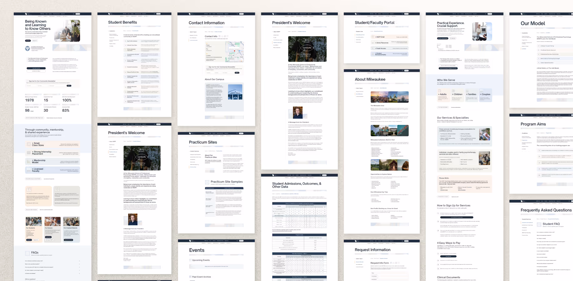
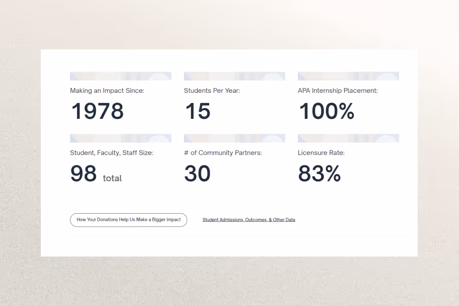
A detailed sitemap guided us through each page, allowing us to make informed decisions on where to expand layout structures, where to streamline content, and what parameters were required from a compliance perspective.
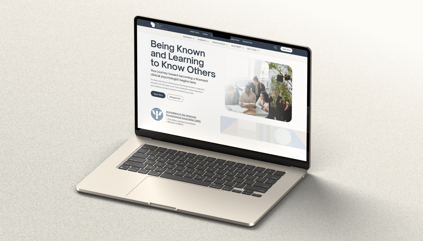
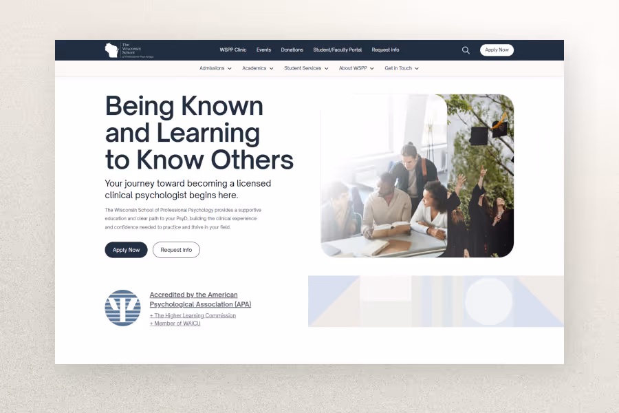
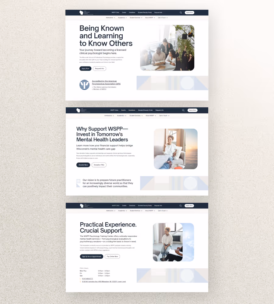
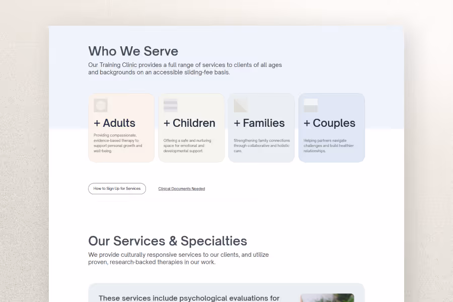
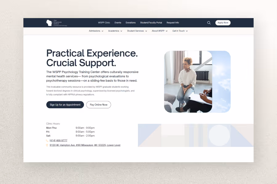
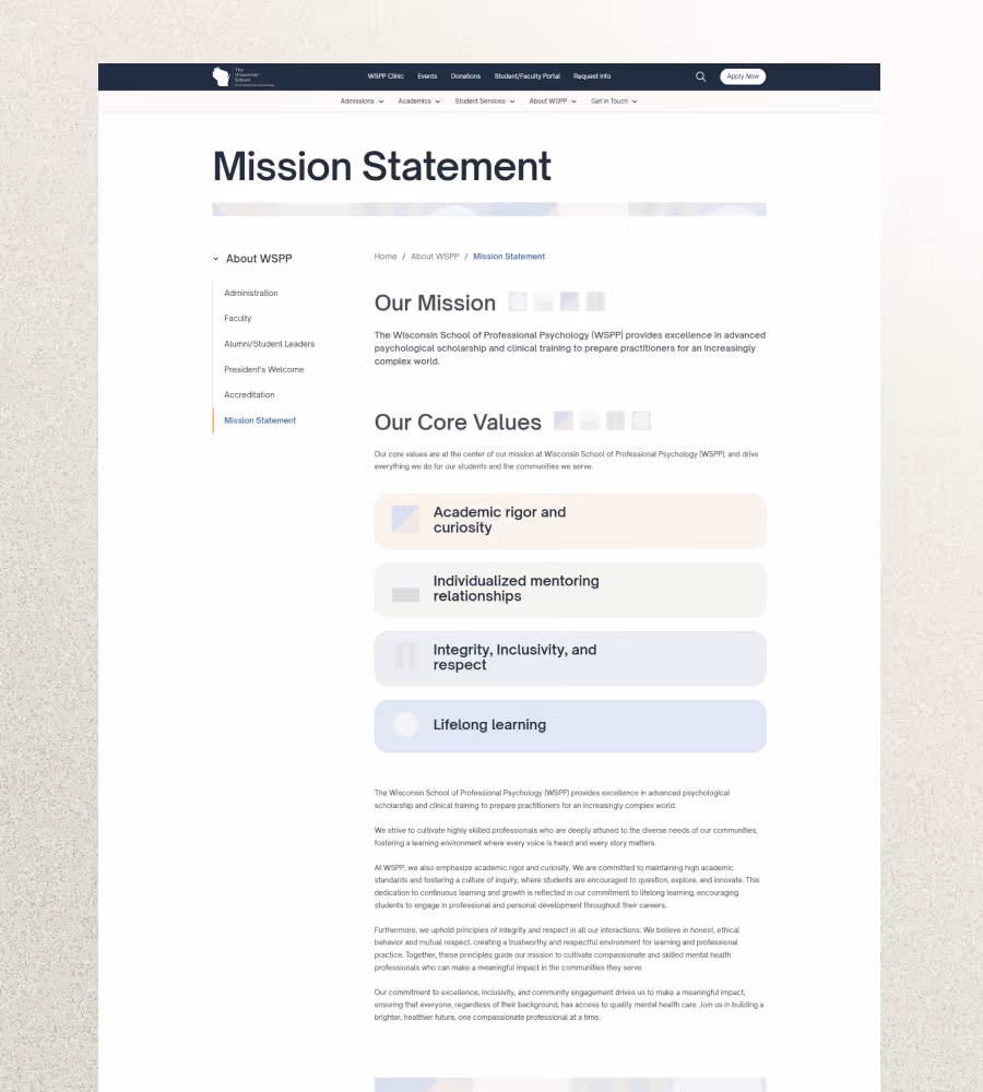
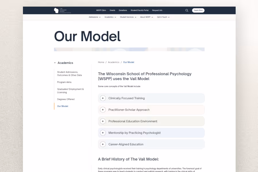
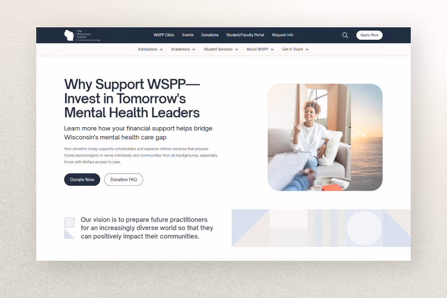
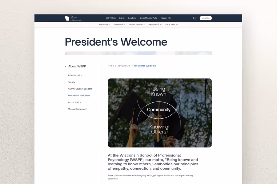
Competitive analysis and moodboarding quickly led us to hone in on a distinct visual direction. We opted for a light mode aesthetic with a clean, white background and a neutral color palette to evoke a sense of calm. Main inspiration was drawn from modular Bauhaus-style design, arranging simple shapes into unique patterns depending on the context.
This approach intentionally differentiated WSPP from typical educational websites that lean heavily on generic stock photography. Utilizing these modular shapes as a recurring design motif added visual interest across the site without relying on text and photos alone.
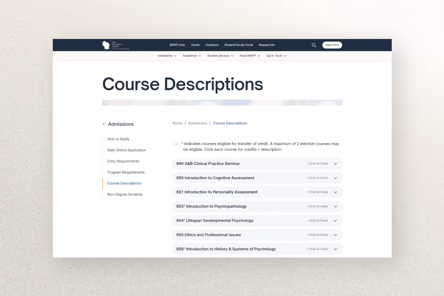
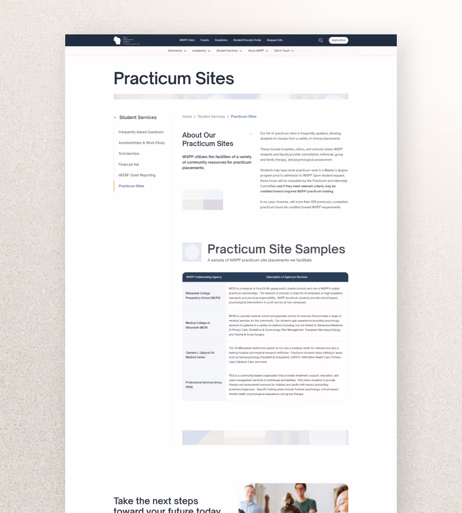
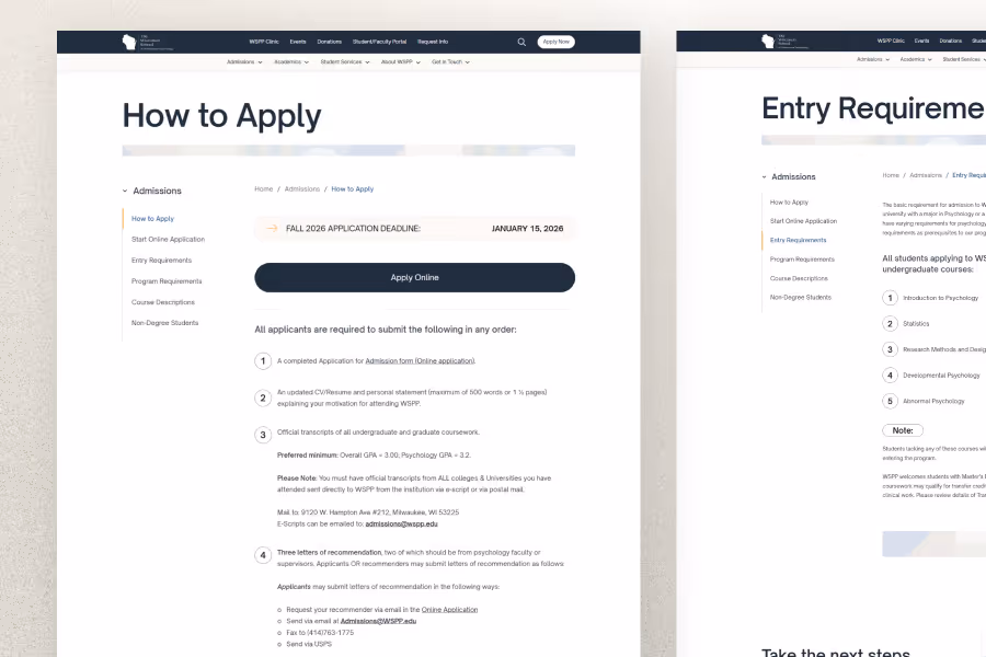
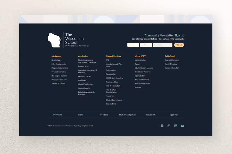
To drastically improve the website’s information architecture, I developed a cleaner page hierarchy for subpages that incorporated a dedicated sidebar navigation and breadcrumbs. This ensured visitors would always have a clear sense of orientation within a complex, 50+ page website.
The primary hubs used by students, educators, staff, and the community were emphasized directly within the main navigation, while deeper subpages were neatly organized into simple dropdowns within a secondary menu structure.
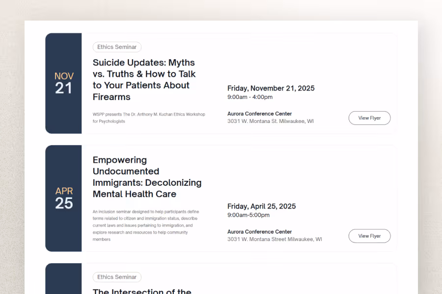
All development was executed in Webflow utilizing the Client-First framework to standardize the build and simplify class naming conventions, typography scales, color swatches, and global spacing presets. Multiple CMS collections were configured to allow staff easy maintenance of upcoming events, faculty directories, and course catalogs.
The core development philosophy was to deliver a website that loads incredibly fast, prioritizes effortless internal maintenance, and adheres strictly to best practices for SEO and accessibility.